
Plot Upload Test
How to Make Scatter Plot with Python
Preparation
First Step is to import the tools and the dataset we need
import pandas as pd
import seaborn as sns
from matplotlib import pyplot as plt
url = "https://raw.githubusercontent.com/PhilChodrow/PIC16B/master/datasets/palmer_penguins.csv"
penguins = pd.read_csv(url)
penguins.head()
| studyName | Sample Number | Species | Region | Island | Stage | Individual ID | Clutch Completion | Date Egg | Culmen Length (mm) | Culmen Depth (mm) | Flipper Length (mm) | Body Mass (g) | Sex | Delta 15 N (o/oo) | Delta 13 C (o/oo) | Comments | |
|---|---|---|---|---|---|---|---|---|---|---|---|---|---|---|---|---|---|
| 0 | PAL0708 | 1 | Adelie Penguin (Pygoscelis adeliae) | Anvers | Torgersen | Adult, 1 Egg Stage | N1A1 | Yes | 11/11/07 | 39.1 | 18.7 | 181.0 | 3750.0 | MALE | NaN | NaN | Not enough blood for isotopes. |
| 1 | PAL0708 | 2 | Adelie Penguin (Pygoscelis adeliae) | Anvers | Torgersen | Adult, 1 Egg Stage | N1A2 | Yes | 11/11/07 | 39.5 | 17.4 | 186.0 | 3800.0 | FEMALE | 8.94956 | -24.69454 | NaN |
| 2 | PAL0708 | 3 | Adelie Penguin (Pygoscelis adeliae) | Anvers | Torgersen | Adult, 1 Egg Stage | N2A1 | Yes | 11/16/07 | 40.3 | 18.0 | 195.0 | 3250.0 | FEMALE | 8.36821 | -25.33302 | NaN |
| 3 | PAL0708 | 4 | Adelie Penguin (Pygoscelis adeliae) | Anvers | Torgersen | Adult, 1 Egg Stage | N2A2 | Yes | 11/16/07 | NaN | NaN | NaN | NaN | NaN | NaN | NaN | Adult not sampled. |
| 4 | PAL0708 | 5 | Adelie Penguin (Pygoscelis adeliae) | Anvers | Torgersen | Adult, 1 Egg Stage | N3A1 | Yes | 11/16/07 | 36.7 | 19.3 | 193.0 | 3450.0 | FEMALE | 8.76651 | -25.32426 | NaN |
Data cleaning
Raw data is usually hard to read and analyze, so we need to pick the data we will use
#Shorten the name of species
penguins["Species"]=penguins["Species"].str.split().str.get(0)
#Remove particular rows of sex that is not properly recorded
penguins=penguins[penguins["Sex"]!="."]
#Pick the data we want and get rid of Nas
data =["Species","Island","Culmen Length (mm)","Culmen Depth (mm)","Flipper Length (mm)","Body Mass (g)","Sex"]
penguins=penguins[data]
penguins=penguins.dropna()
Let’s check the data now
penguins.head()
| Species | Island | Culmen Length (mm) | Culmen Depth (mm) | Flipper Length (mm) | Body Mass (g) | Sex | |
|---|---|---|---|---|---|---|---|
| 0 | Adelie | Torgersen | 39.1 | 18.7 | 181.0 | 3750.0 | MALE |
| 1 | Adelie | Torgersen | 39.5 | 17.4 | 186.0 | 3800.0 | FEMALE |
| 2 | Adelie | Torgersen | 40.3 | 18.0 | 195.0 | 3250.0 | FEMALE |
| 4 | Adelie | Torgersen | 36.7 | 19.3 | 193.0 | 3450.0 | FEMALE |
| 5 | Adelie | Torgersen | 39.3 | 20.6 | 190.0 | 3650.0 | MALE |
Visualization
Let’s start with a simple scatter plot, examing the culmen length and culmen depth of penguins
sns.relplot(data=penguins,
           x="Culmen Length (mm)",
           y="Culmen Depth (mm)")
<seaborn.axisgrid.FacetGrid at 0x1a694178370>
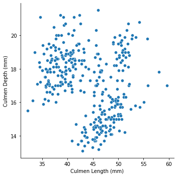
Not much information we could get from the graph, let’s distinguish the points by species
sns.relplot(data=penguins,
           x="Culmen Length (mm)",
           y="Culmen Depth (mm)",
           hue = "Species")
<seaborn.axisgrid.FacetGrid at 0x1a6993e7160>
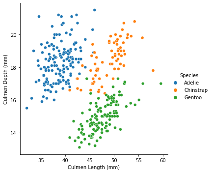
Now we have a decent graph to analyze. If we want further investigation, let us take sex and Island into account.
sns.relplot(data=penguins,
           x="Culmen Length (mm)",
           y="Culmen Depth (mm)",
           hue = "Species",
           col ="Sex",
           row ="Island")
<seaborn.axisgrid.FacetGrid at 0x1a699571ee0>
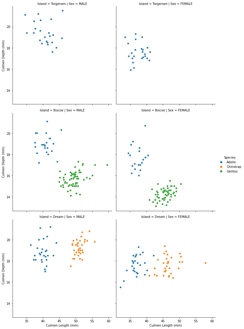
Now we have a informative scatter plot.
Written on April 14, 2022